ClickTime Time Entry
Project timeline: 7 business days
Company: ClickTime — a time-tracking, task management, and project management tool.
My role & responsibilities: (Sole) UI/UX designer and conducted competitive analysis
intergrated the internal style guide to maintained visual cohesion and consistency, used Google Analytics track functionality engagement, and collaborated with a software engineer to implement the UI changes, as well as contributed to the front-end implementation.
Platforms: Desktop web application
Opportunity: ClickTime was making other improvements and additions to the product as it was ramping for the software's newest version release. We took this auspicious opportunity to include the refreshed interfaces for the 3 time tracking pages along with the new updates.
Constraints: These pages have undergone multiple permutations and subtle changes over the years. As a result, multiple layers had accumulated and the code had become fragile and suspective to breaking QA tests. Additionally, these 3 pages used a version of ExtJS Javascript framework that is no longer supported and led us to be very conscious of the library's constraints when making more substantial revisions to the interface.
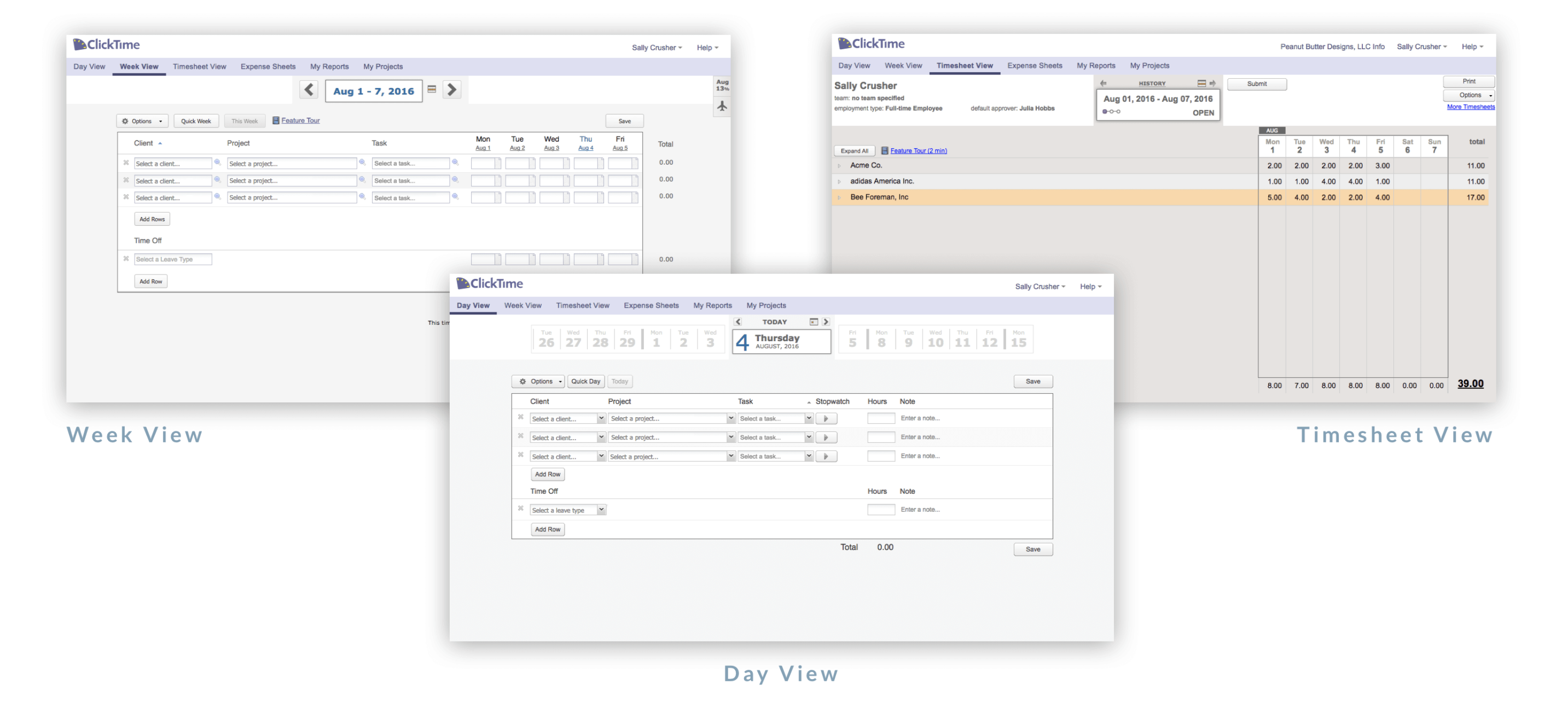
Before: Time entry pages
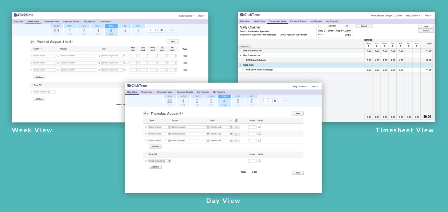
The three pages Day View, Week View, and Timesheet View are the company's core time tracking functionality and highest number of user traffic.
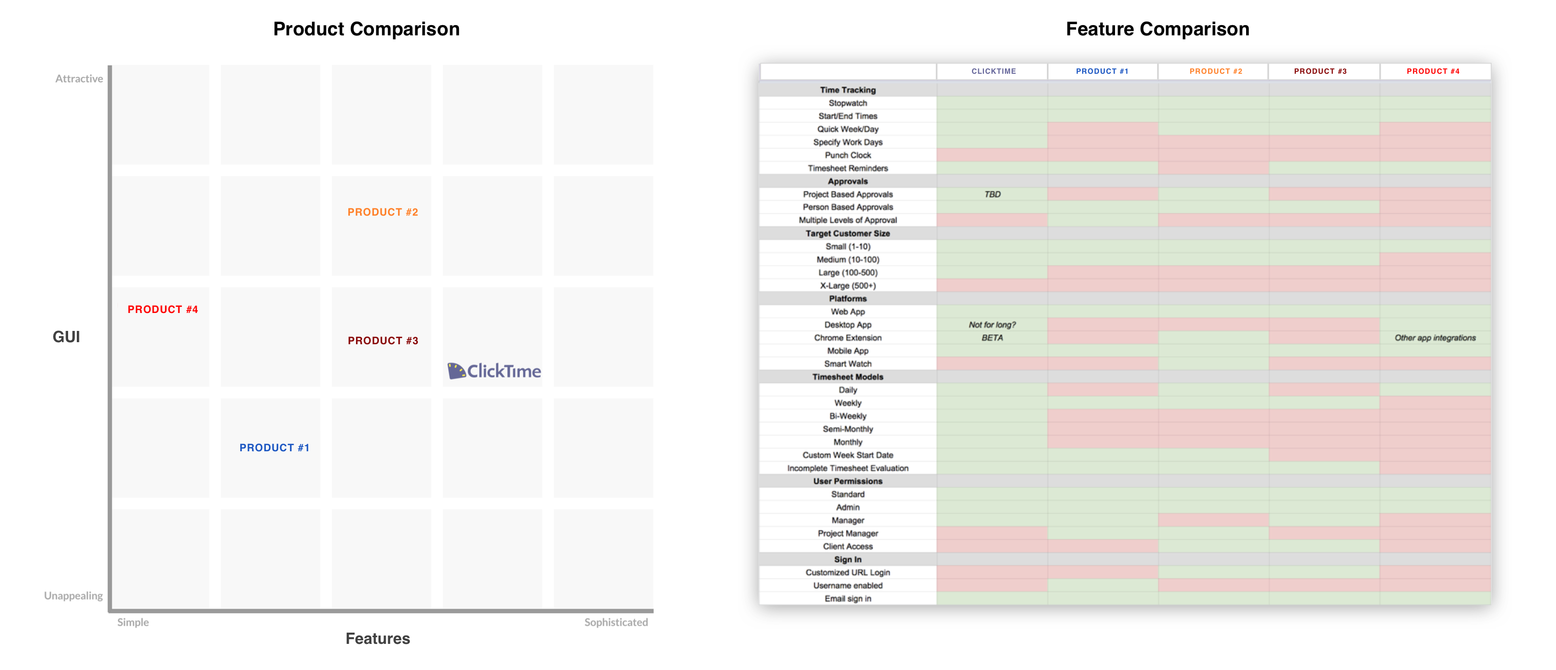
Competitive analysis
To begin my research, I conducted a five week project of tracking my time with five different products, including ClickTime. I chose four other competitor products and placed myself as a user who needed to track my time spent on projects.
The feature comparison spreadsheet (right) shows how each companys product suite stacks against one another. This also helped ClickTime’s Customer-facing and Sales team compare features when chatting with prospects.
In the product comparison map (left), the axes were Features and GUI and displayed how I felt each company rated in both categories. I saw that Product #2 and #3 were ClickTime’s closest competitors and took note of their successes.
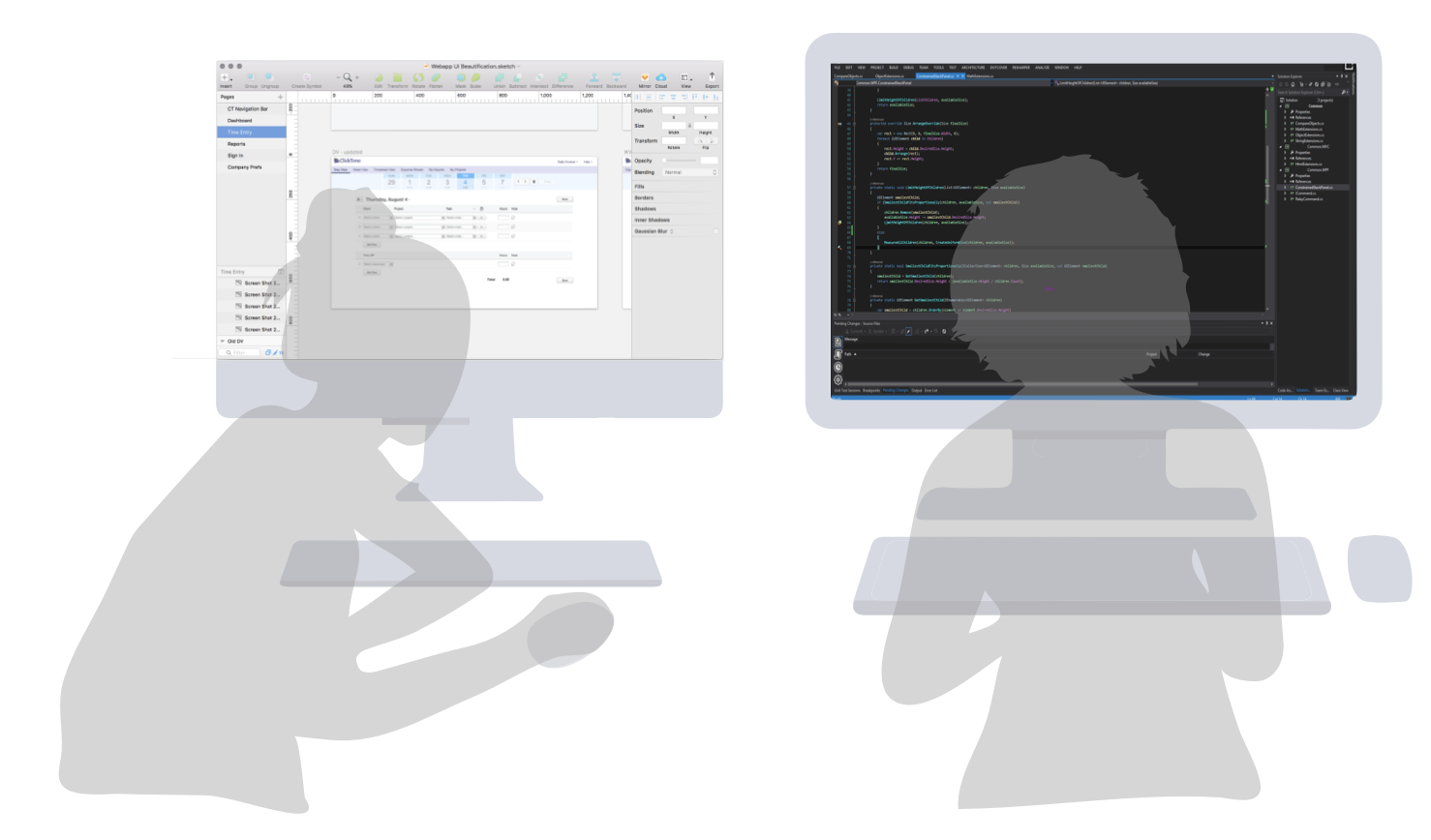
Frontend exploration and implementation
My biggest priorities included updating colors, removing redudant or unused functionality, uniforming the typgraphy and iconography, improving copy for messaging, and incorporating more intuitive user interactions.
Some steps involved in the discovery phase included: inspecting with Chrome Dev Tools, pair programming with ClickTime's Software Engineer, and making additional changes on Sketch. Following this, I eventually committed my own code changes after getting my own dev environment.
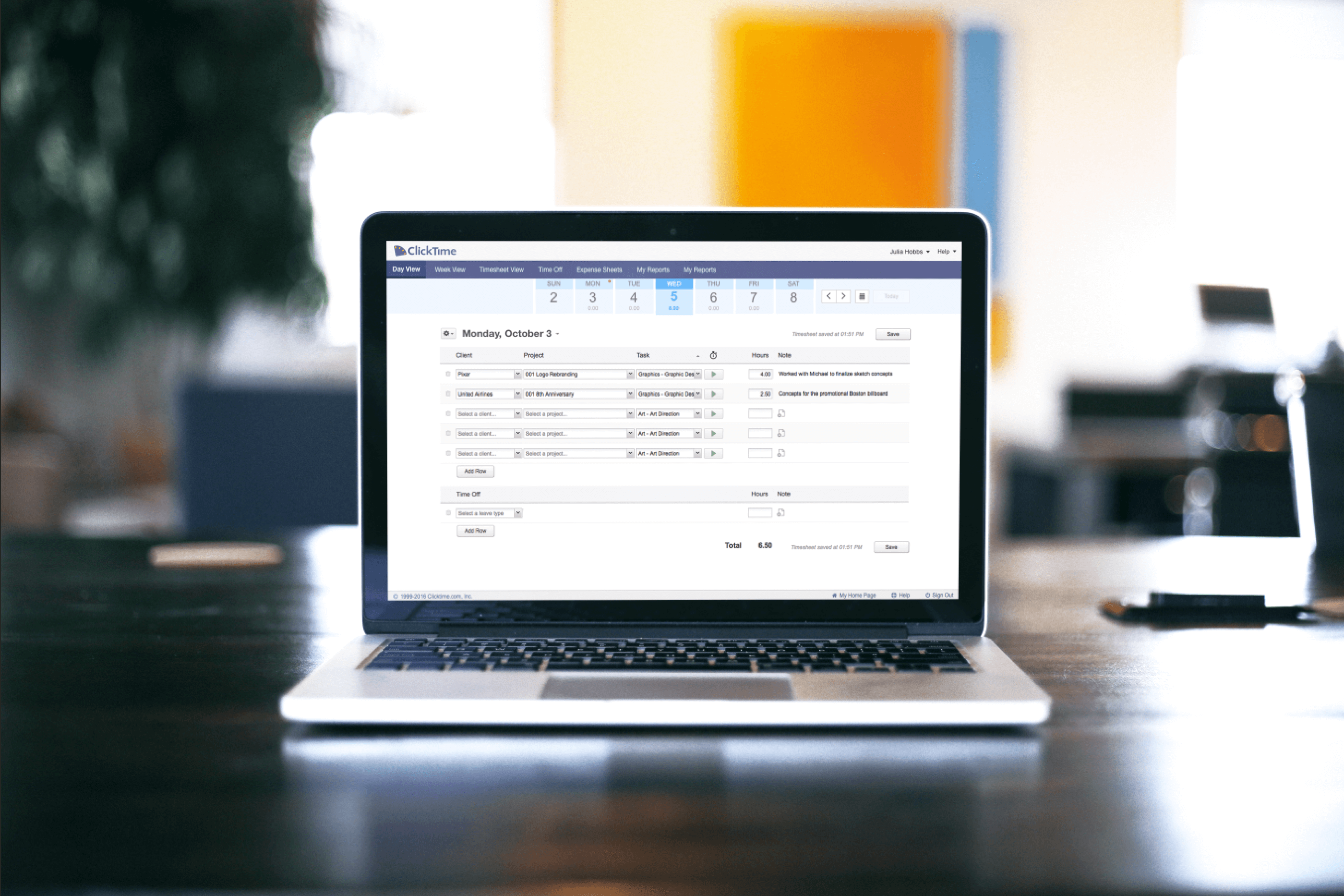
✨ After: Time entry pages ✨
Refreshing these infamous and legacy pages provided satisfying results as I had this opportunity make an impact on the product's core experience.
Reflection & looking forward
Approaching the tasks was initially daunting and implementing these changes was no simple feat as I ran into technical constraints and limited development resources. Playing both the roles of Designer and Designer-turned-Developer had lent me to really enjoy learning about front-end development and appreciating the work of the software and QA engineers.
At the time I had left the company, the time entry pages had completed about 80% of its conception. In the end, the UI refreshes for the time entry pages as it was released had received several appraisals and would provide guidance for the company's prospective UI refreshes.
Compare the old and updated time entry pages below.