Saved Car Listings
Date: Oct 2021 — Dec 2021
Company
CarGurus — an car research and shopping website that assists users in finding listings for used and new cars and contacting sellers.
My role & responsibilities
- Lead (and sole) designer
- Partnered with Research for exploration and usability testing
- Completed competitor analysis (analogous and direct)
- Produced all prototypes for testing and development
- Handled UX strategy from vapor and A/B testing, MVP to V2
Platforms: Desktop/tablet/mobile web browsers, mobile app (iOS & Android)
Outcome: Significant conversion increase for mobile (+1.67%) and desktop (+3.65%)
The challenge
Our users told us they shop online for cars because having photos and vehicle details upfront, comparing prices, browsing without sales pressure is a more comfortable and convenient experience. Our current shopping experience on Cargurus.com allows users to “save” car listings they’re interested in so they can easily refer back to them in their journey.
My team was tasked to improve the existing Saved Car Listings experience which has received feedback that it was hard to use, inefficient, and “busy” looking.
How might we support our customers in their early stage shopping journey to find the right car?
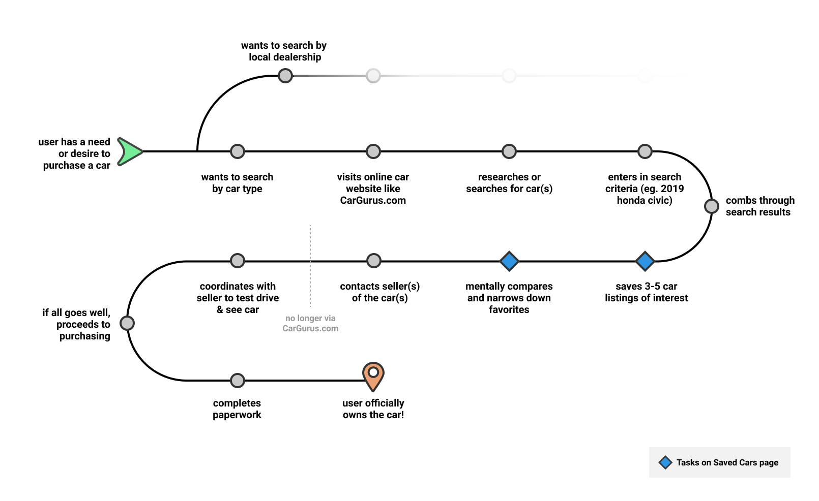
Understanding the user journey
The online car shopping journey for a CarGurus user at a high level can be seen in the diagram below. My team was focused on blue diamond steps ? below.
The existing Saved Cars experience
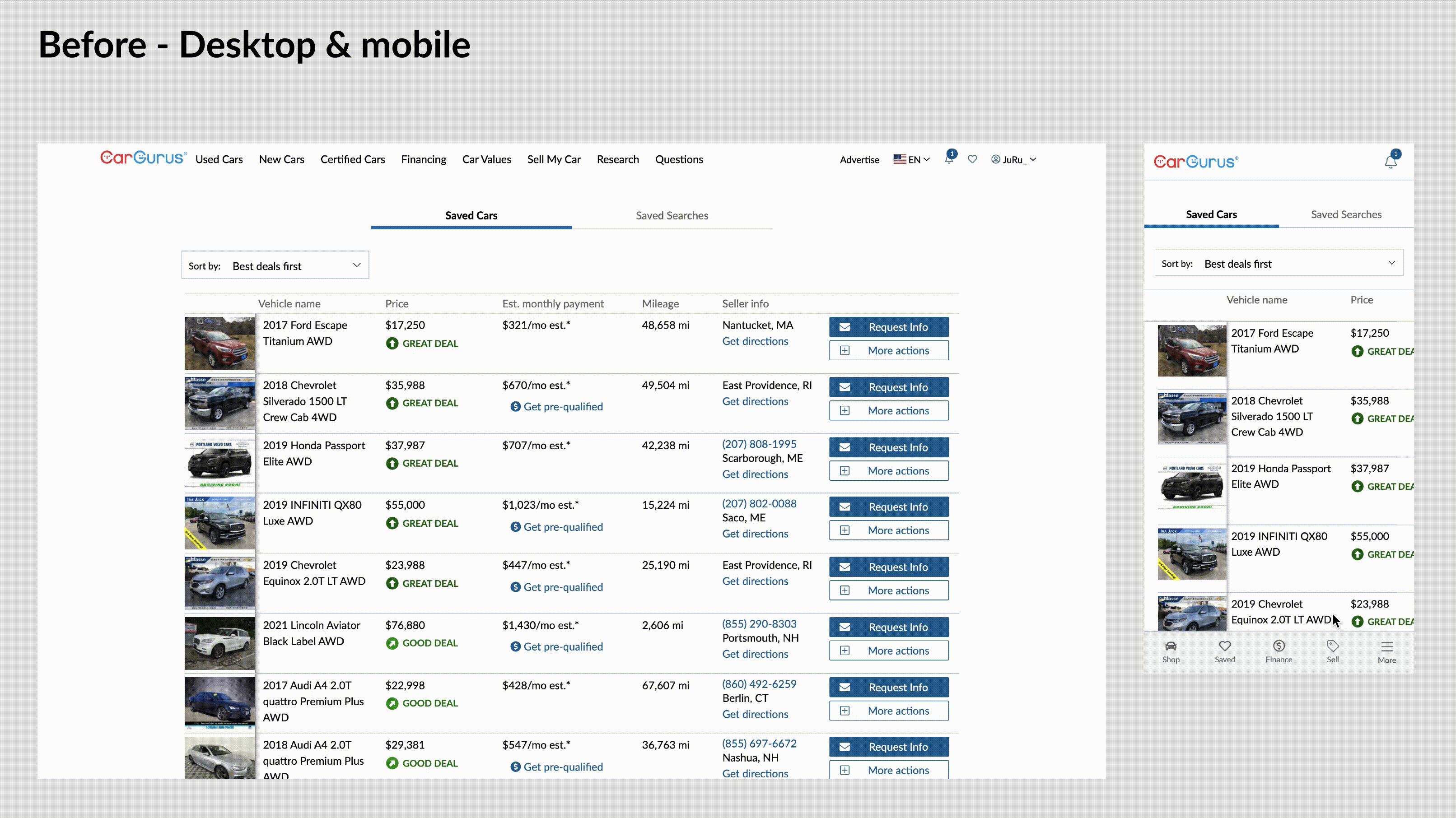
Key feedback for current experience:
- The car images are too small
- It's unclear how to un-save a car listing
- The mobile experience takes too look to see the listings details in one view
- Car details ranked in the order of importance: photo, car name/title, price, mileage, location, seller contact. Everything else is noise
- An average user saves an average of five car listings
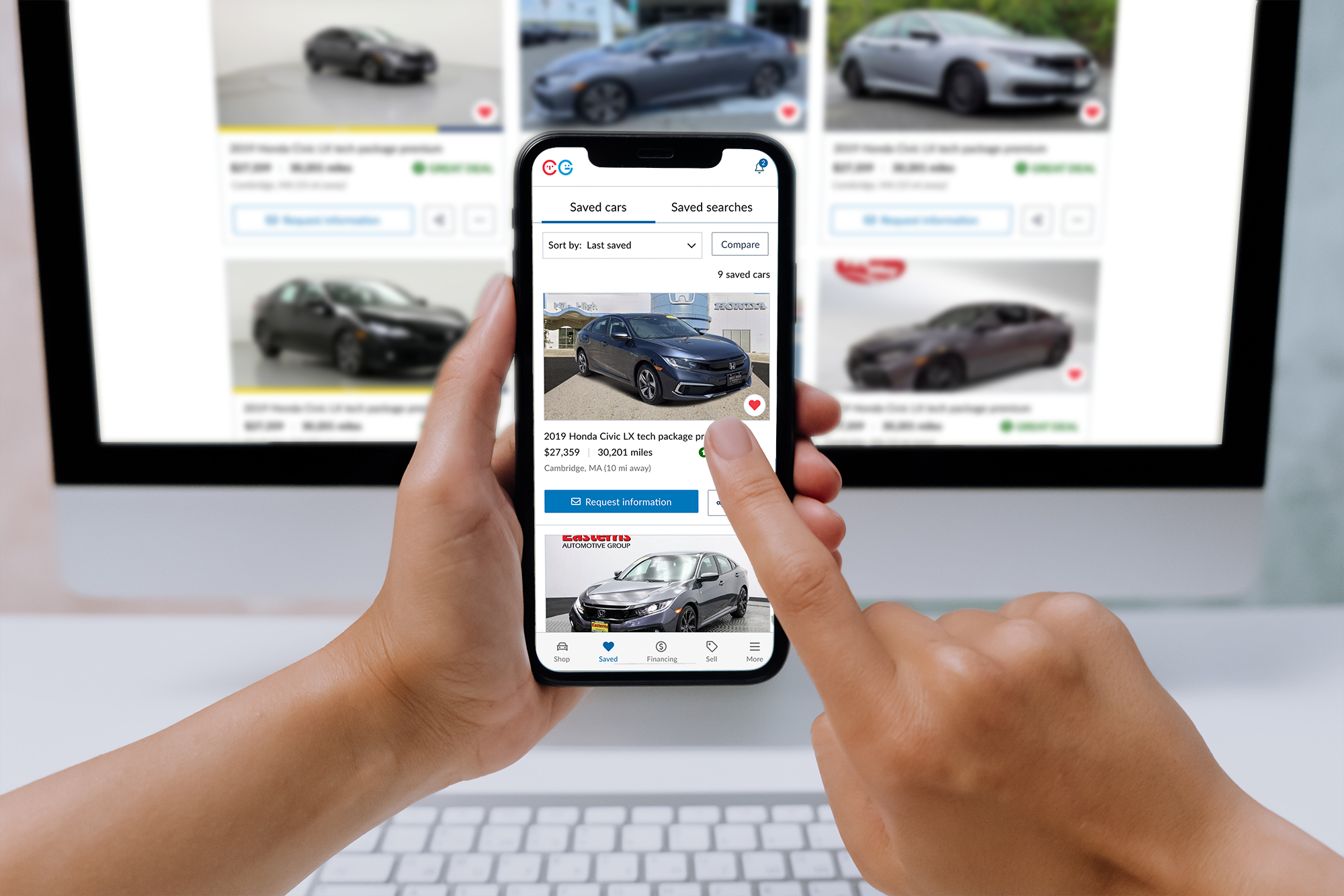
✨ The Saved Cars redesigned experience ✨
Digging into the details & interaction
Major differences made in the redesign include enlarging the car photos significantly as users have indicated this is the most important factor that helps them distinguish their saved car listings.
Secondly, the vehicle information presented in the After redesign such as car title, price, mileage, and location have the main focus and the rest of the details have been tucked away in the new Compare feature (more on that later). The Save button is now visible to make un-saving a car listing much easier.
Lastly, the scrolling orientation was changed to vertical from the previous horizontal scroll. This scrolling behavior matches the search results page that our users are accustomed to and is the standard used in most marketplace analogous products.
Reusing existing functionality
During the exploration and brainstorming of the saved page design, I looked back at previous user research notes and read that several users stated they liked having a scrollable table layout as a means to compare the vehicle details quickly.
Not wanting to remove that functionality in the redesign, we ran a quick vapor test to gauge user interest in a this functionality with the addition of a “Compare” button that triggered a modal that stated the functionality wasn’t available in their region.
The test button generated enough user engagement (ie. clicks) to justify reusing the former table layout to become the new listing comparison tool.
Outcome and learnings
The new experience which aimed to help users easily save and compare car listings was released to all users in December 2021. It resulted in a significant conversion increase in mobile (+1.67%) and desktop (+3.65%) for shoppers contacting sellers and was relatively consistent for the desktop experience. For reference, any conversion increase greater than .05% is a big win for the team.
Given that our mobile app and mobile web users (approximately 60% of our user base) tend to be more engaged and considered high-quality leads for the dealerships, it was a great outcome all around.
We learned that by removing distractions and friction for our users during the early stages of their shopping journey, they are more likely to return and engage with our site and ultimately submit a lead.
Evolving into the next phase
With the success of the saved listings redesign and addition of the compare listings functionality, we are looking to invest in this experience further and evolve the compare functionality to include additional, comprehensive stats such as vehicle history, safety rating, and user reviews.
See a sneak peak into the V2 of the car comparison tool below.