Account Hub
Project timeline: 5-6 months
Company: CarGurus — an car research and shopping website that assists users in finding listings for used and new cars and contacting sellers.
My role & responsibilities:
- Lead (and sole) designer
- Completed competitor analysis (analogous and direct)
- Produced all prototypes for testing and development
- Content strategy and information architecture
- Handled UX strategy planning MVP to V2 planning
Platforms: Desktop web browser
The opportunity
Business need
As CarGurus evolves from a listings business into a full e-commerce experience, there's a need for a full account management experience that joins the existing, disjointed pages and provides a foundation for the expansion of our product areas.
User need
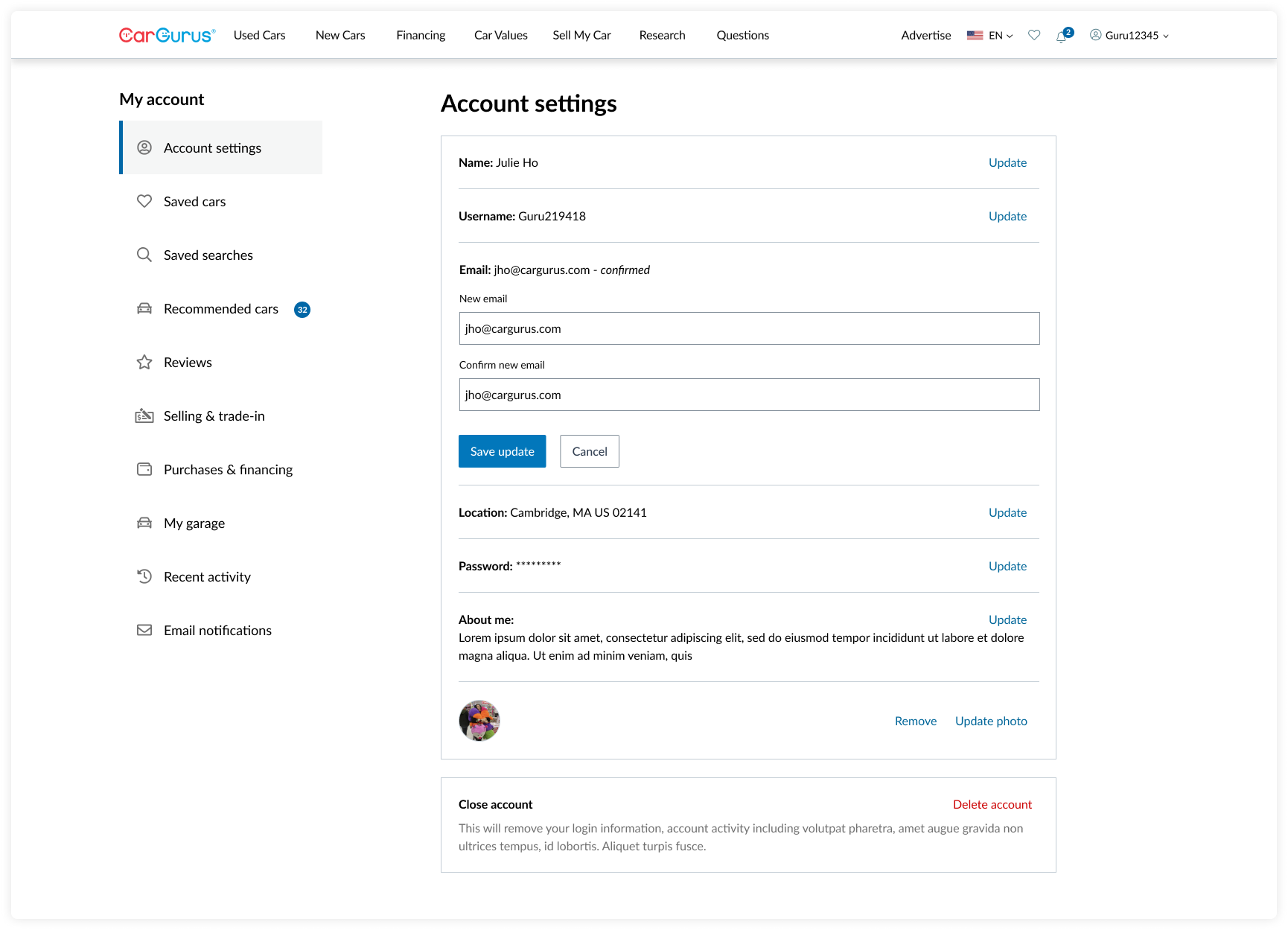
The current experience is a collection of independent pages of account settings, email notifications, saved listings, saved searches, and more that the user would have to access in different areas of the site.
The objective is to create a cohesive account experience so that users can more easily reference their activity and manage their settings, purchases, offers, and financing. On top of this, there wasn't mobile web or mobile app support for some of existing pages.
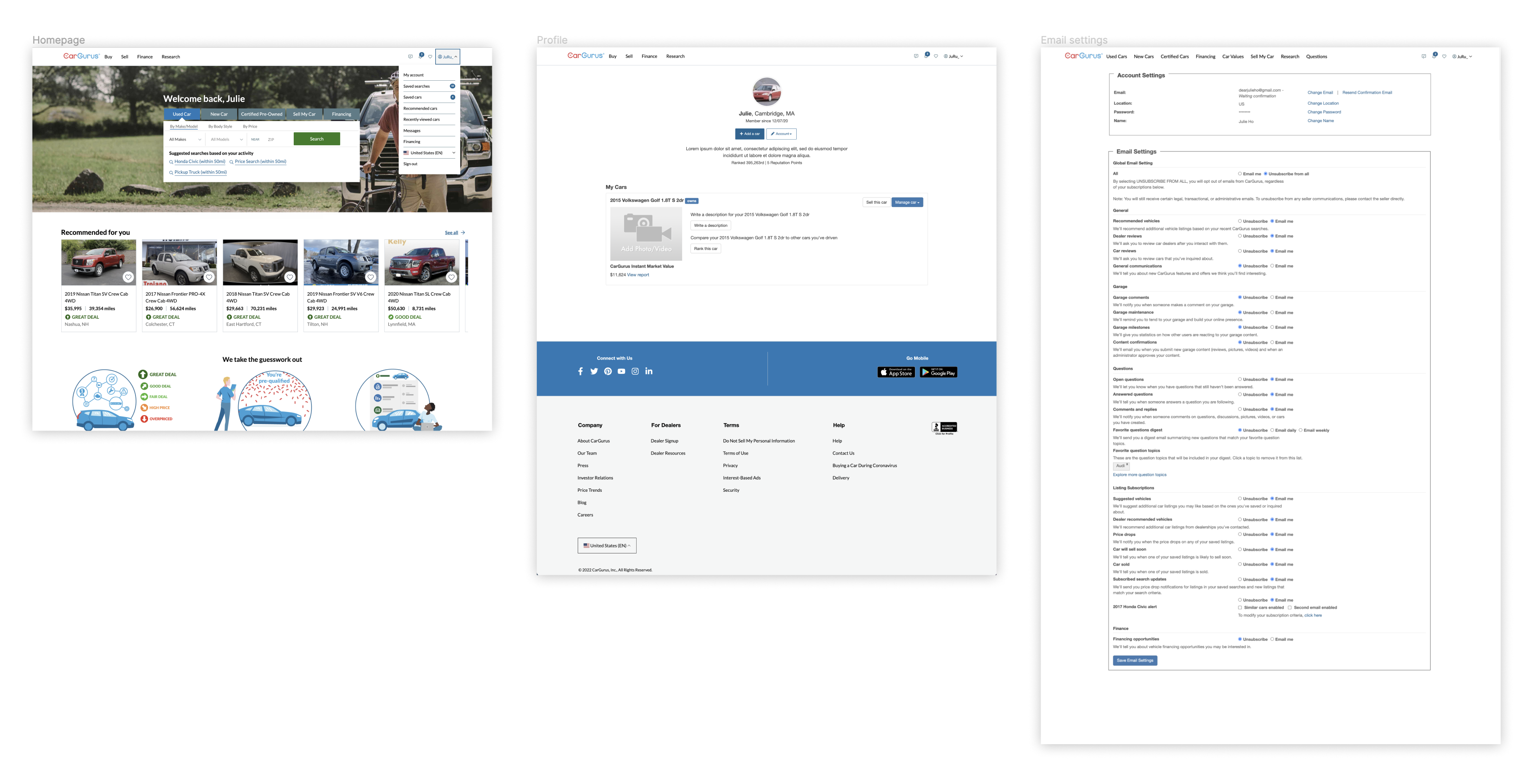
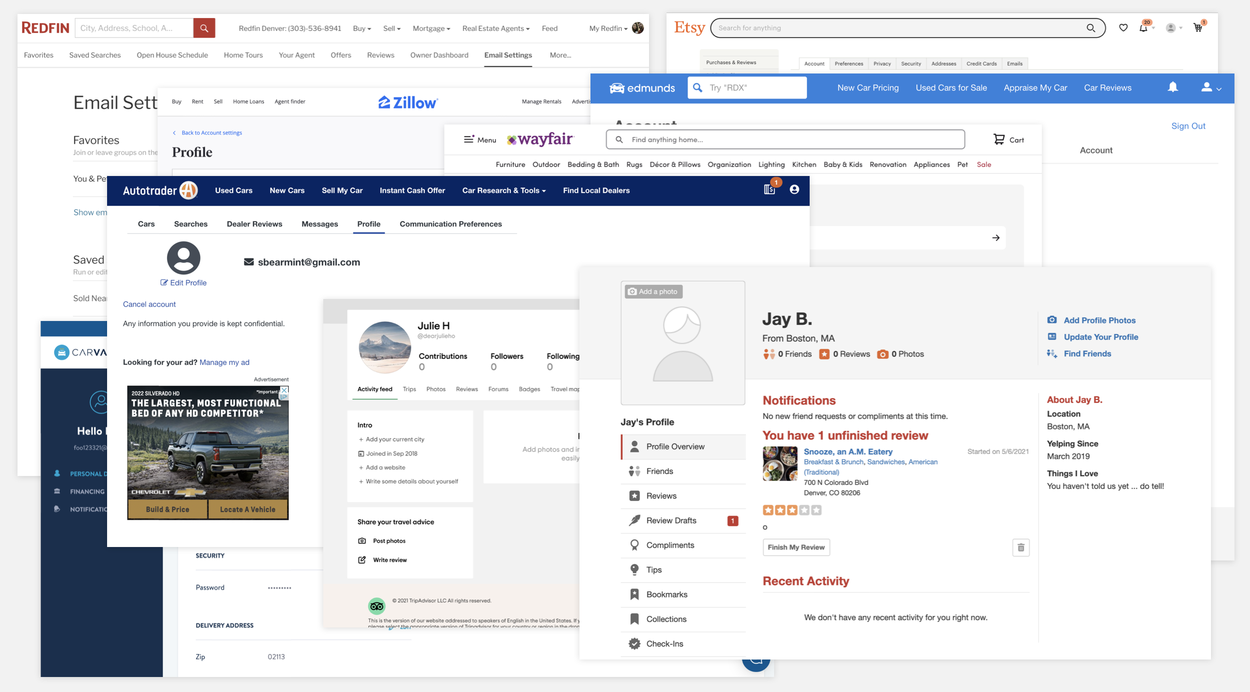
The existing experience of the homepage (left), user profile (center), and Account & Email Settings (right) is shown below.
What does success look like?
In order to be successful, not only do we have to build a scalable structure that supports the growing business areas, we had to ensure that users have a seamless, centralized account experience.
Beginning the project, we took a look at the following metrics as a benchmark of the current user activity.
- How many users are accessing their account and emails settings today?
- How many users are visiting the other pages that will eventually re-homed to the new account hub?
- How many users actually update their bio or profile picture?
- What are complaints our customer support team is hearing about the current experience?
With the creation of the new account hub, we aimed to:
- Build a scalable page navigation/structure that supports future-facing functionality
- Maintain or increase the number of users going to the new account page
- Increase feature engagement with newly grouped pages
- Remove outdated or non-functioning features
- Modernize the pages (tech-wise and UX/UI-wise)
- Support mobile web & mobile app pages
Content planning
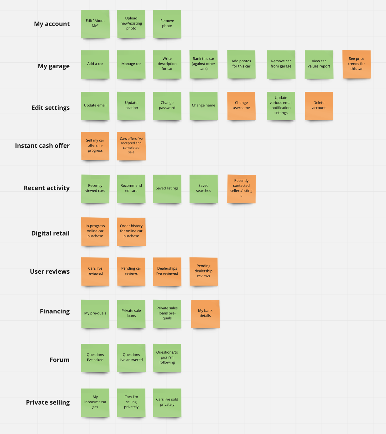
To determine what would get re-homed into the new account hub experience, I started with an audit with existing (green) and net-new pages, functionality, and product areas (orange).
This list was then shopped around to various stakeholders and teams who owned those experiences. We had regular discussions to align on teams' roadmaps, feature prioritization, and timelines.
Cross-team collaboration
To ensure a cohesive user experience, I worked closely with the product teams that would be building upon the account hub foundation in the future. I wanted to make sure we were in alignment with what to expect from their team's requirements for the user experience at a high-level. Some team exercises included wireframing and mapping out the work flows and content blocks that they anticipate in their user's shopping and buying journey.
This largely influenced what type of page structure would be the most appropriate to accommodate the future pages.
Navigation & layout
Scalability of the new account hub was a key project requirement. Other internal teams would need to be able to build upon the foundational structure that our team built.
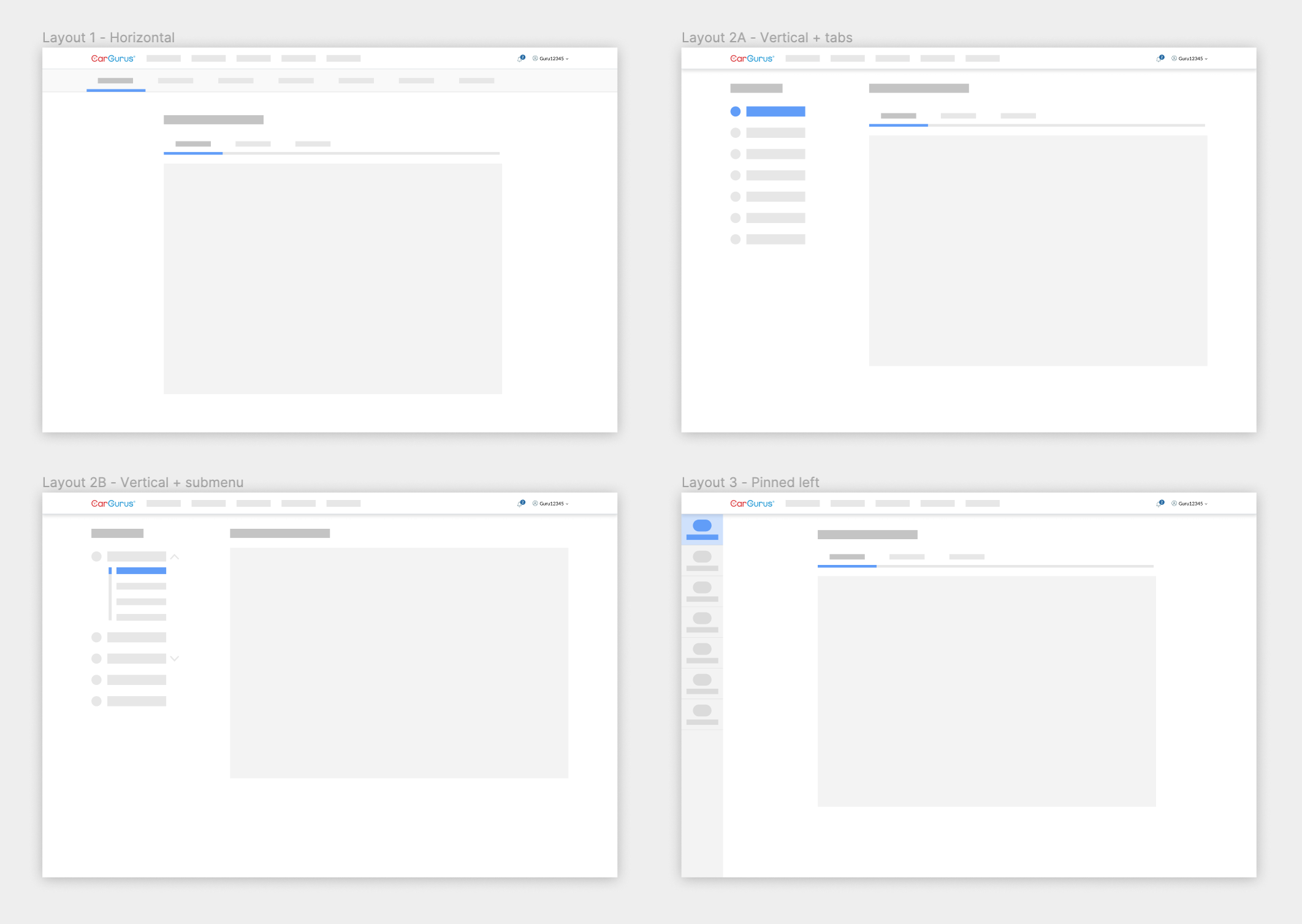
I looked to direct and analogous competitors and products to analyze how their content and navigation was laid out.
I boiled down the page layouts of the products to simple wireframes and weighed the pros & cons that each would entail. The layout I ultimately chose was Layout 2A - Vertical + tabs because the vertical menu had a lot of room for page additions and flexibility.
Feature rollout & testing
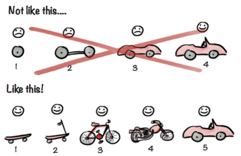
Illustration credit @Henrik Kniberg
This project was a balancing act of building new pages on a new domain, incorporating design system components, migrating existing and legacy pages, and coordinating with teams and their roadmaps.
Because of limited resourcing, we weren't able to secure allocation for user research during the concept phase. Because of this, we leaned heavily on product analytics and insights from our peers to gauge the success of the initial A/B testing rollout.
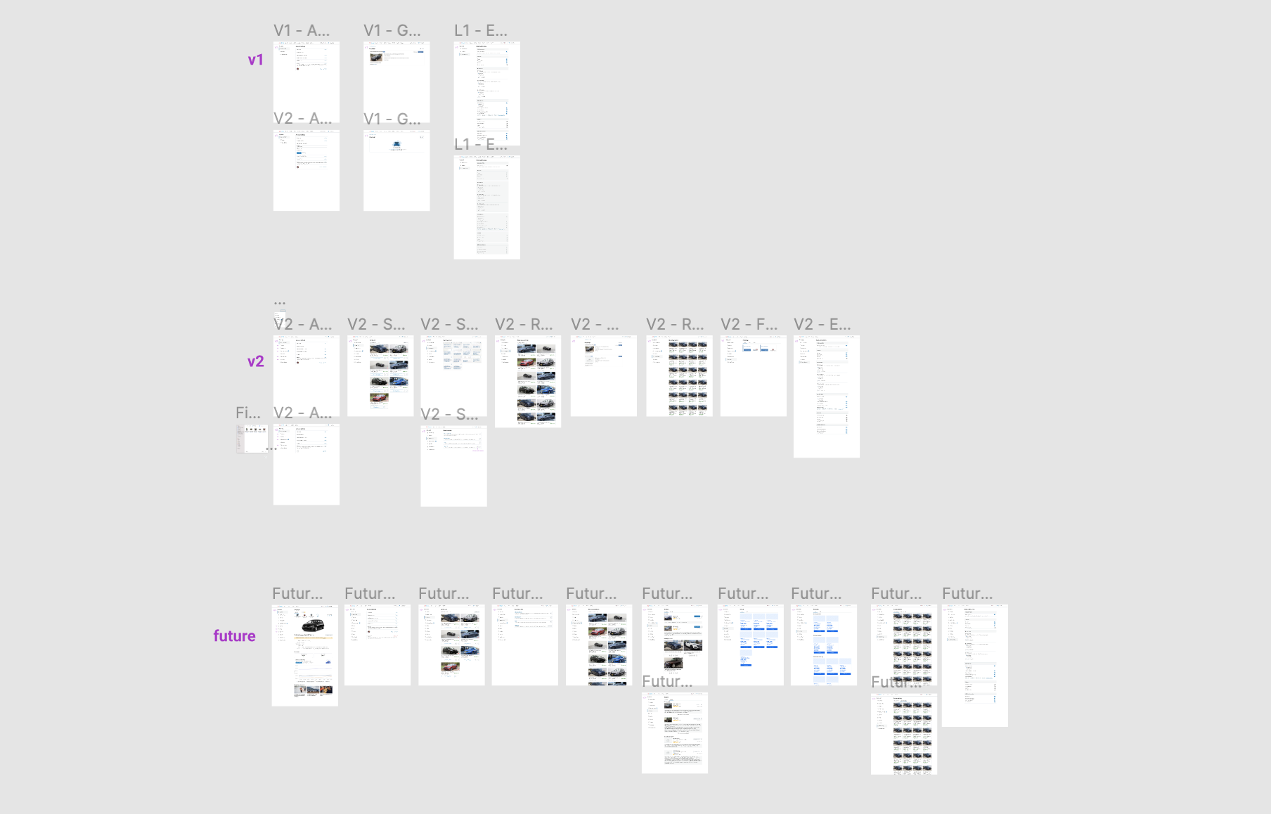
I advised my team to start with our initial rollout (V1/MVP) with the new account hub that contained the same functionality that's available on the site today. This would allow us to not distrupt the user workflow, have a 1:1 comparison for A/B testing, and roll out the feature sooner. At this point, other teams could theoretically build their functionality for their product areas on the platform my team created.
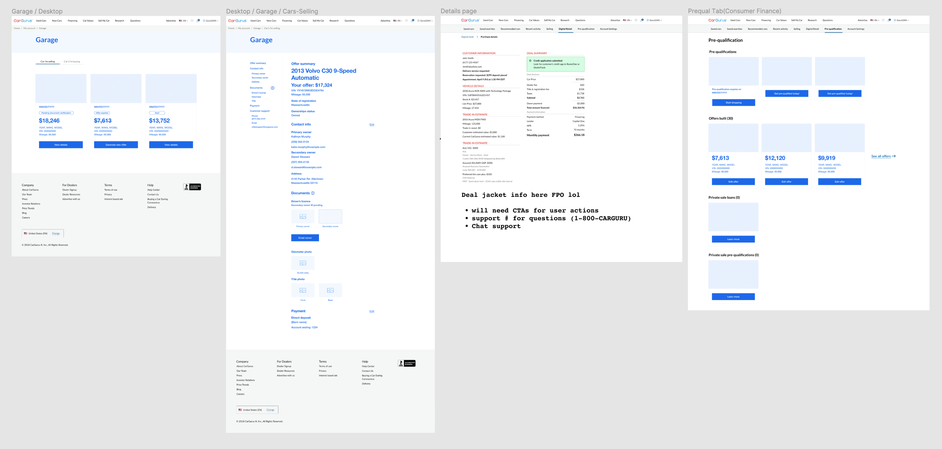
Our team would later follow-up with V2 that migrated existing pages to the new Account Hub. This change would not alter how the pages looked or functionality as it would only update the existing URLs to the new domain and navigation.
The Future phase would include the newer pages and functionality of the e-commerce experience (selling your car and buying a car 100% online) that other CarGurus teams would release. This new account hub allows for feature expansion and additional pages for the evolving business.
✨ Account Hub V2 ✨
Initial MVP test findings
As of March/April 2022, early findings in our A/B test have shown a 78% increase in page visits to the new experience. This is exciting for the team as this is a strong indication that the future product versions of the Account Hub will likely result in greater feature discoverability and value for the users.