ClickTime Style Guide
Company: ClickTime — a time-tracking, task management, and project management tool.
My role & responsibilities:
UI Designer
Conducted extensive audits of the visual components in the web application
Built the UI components library in a Sketch file for faster prototyping
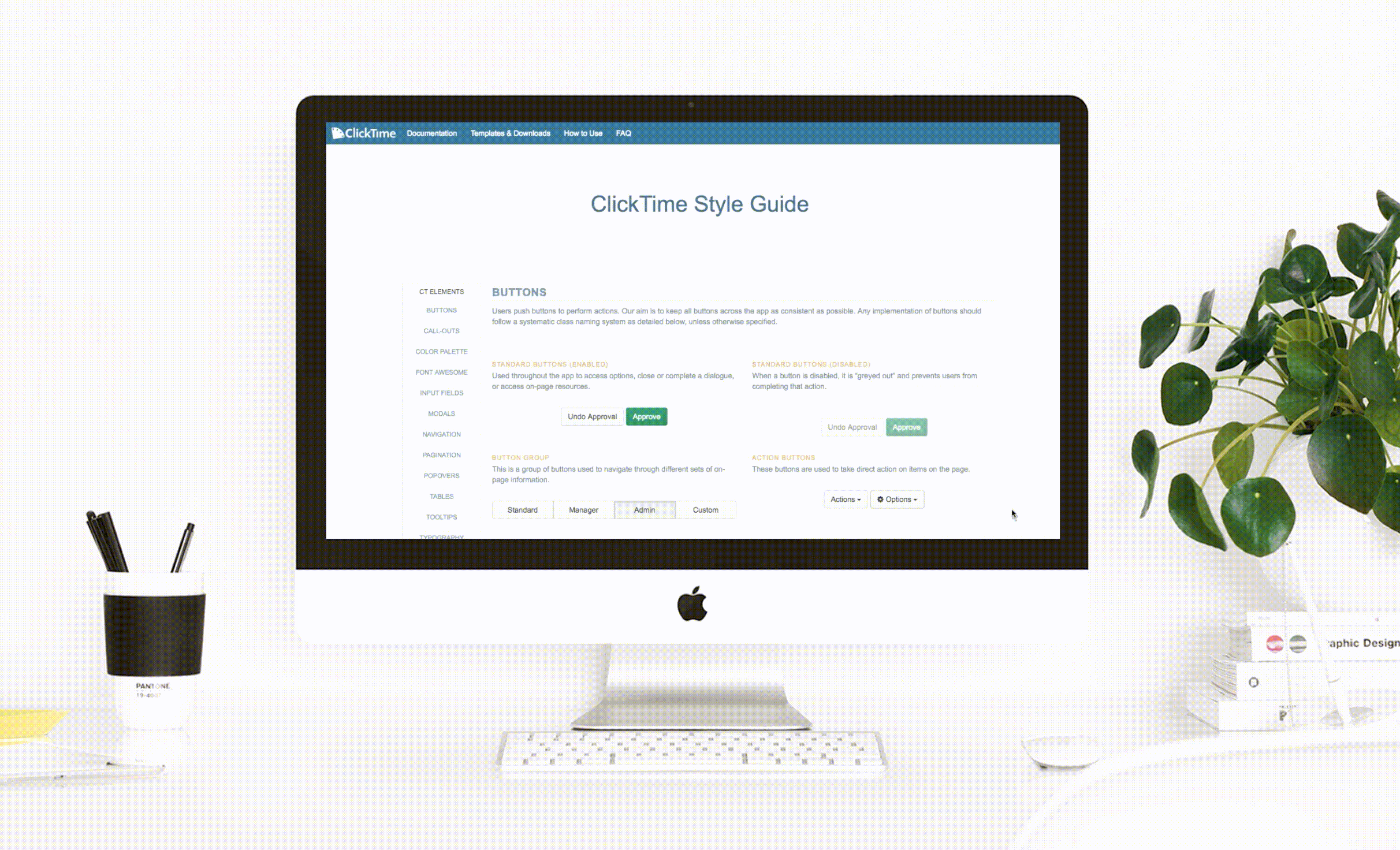
Provided thorough documentation about UI component behavior, examples within the app, and design specs
UI Developer
Fully developed the style guide with HTML, CSS, Javascript, jQuery and Bootstrap
Used GitHub for version control, code review, and final handoff to development team
Platforms: Internally hosted website
Opportunity: Prior to my addition to the small design team of two, the software had led itself to inconsistent UI/UX and accumulated design debt over the years. Being a strong supporter of visual consistency, I took this opportunity to design and develop the company's first style guide and documentation.
Benefits: This would serves as the single source of truth for the Design, Product, Engineering, and QA teams and help resolve ambiguity during software development. Lastly, having clear guidelines supports a positive company brand image by prioritizing visual cohesion within the product and increases user's confidence in the company's credibility and competency
Visual audit
I kickstarted the project by combing through the webapp and logging all the visual elements. Doing so allowed us to get a very clear idea of the inconsistency when all laid out and a record of areas to retroactively update in the future.
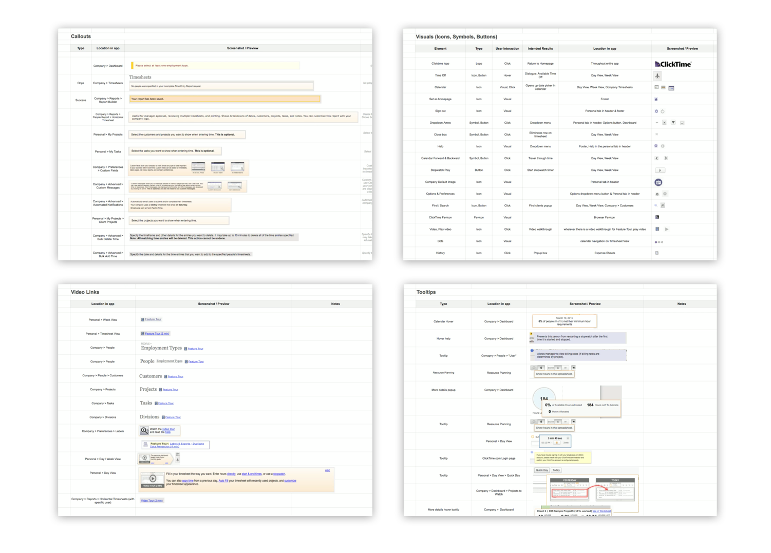
Visual audit & documentation
I kickstarted the project by combing through the webapp and logging all the visual elements. Doing so allowed us to get a very clear idea of the inconsistency when all laid out and a record of areas to retroactively update in the future.
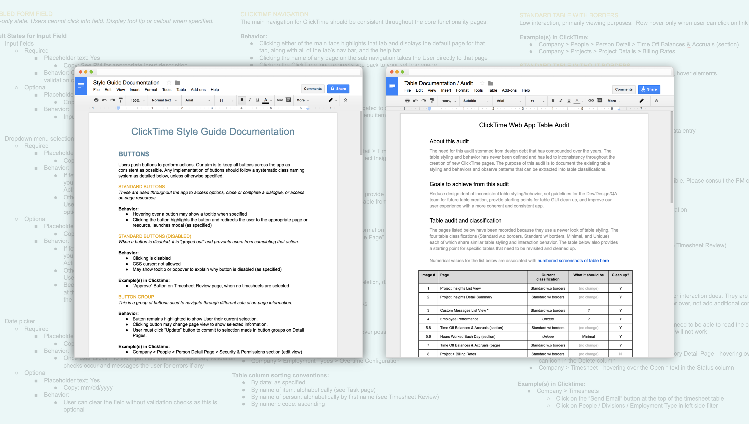
Documentation & more audits
I began writing documentation for component usage guidelines and made another audit for the existing table component. These would serve as a resource for developers and QA when building and checking UI implementation.
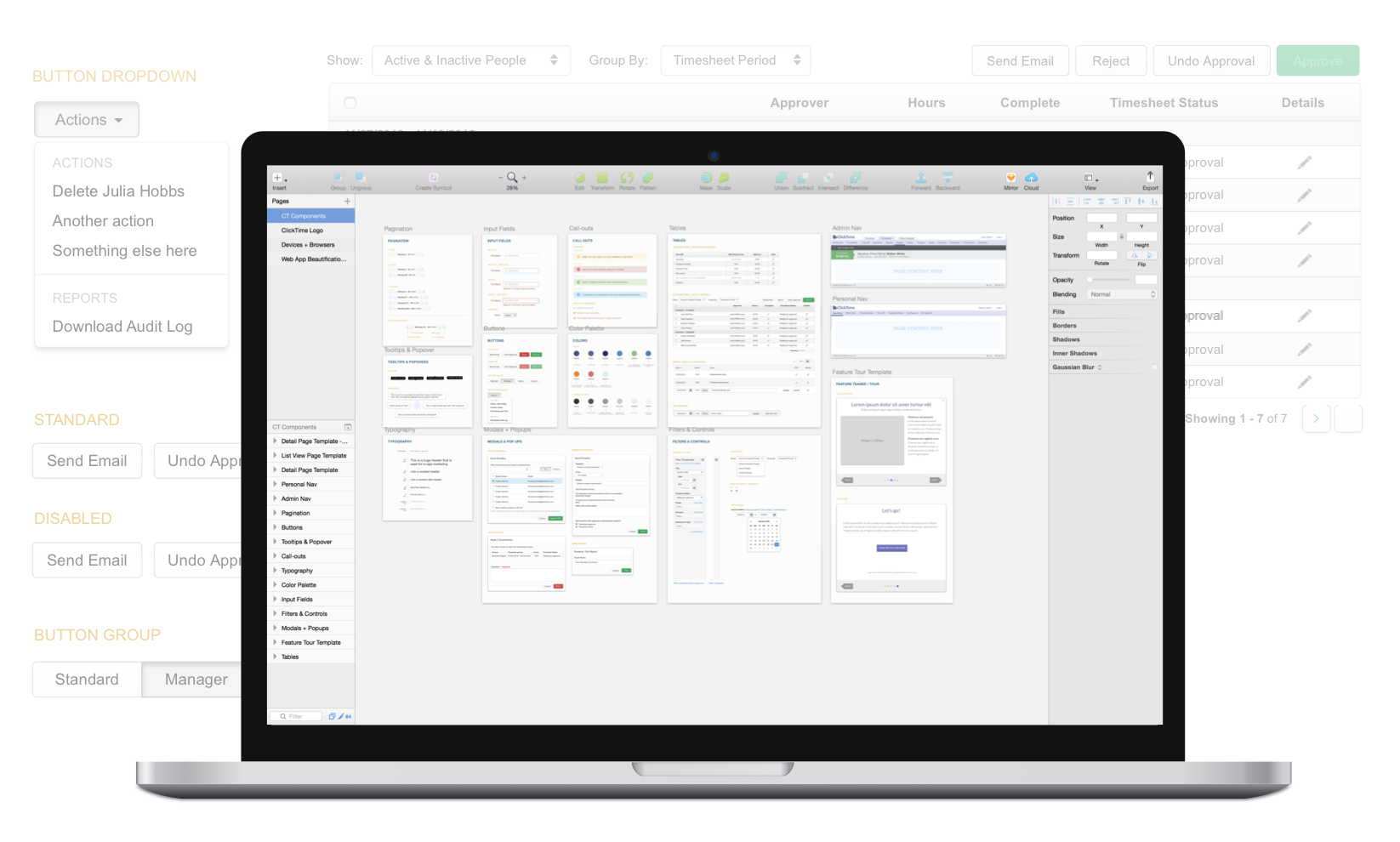
Component library in Sketch
I had created a corresponding Sketch file that match the components on the web-based style guide. Having this components library has significantly improved the efficiency of prototype creation for future designers and ensured consistency upon project handoff.
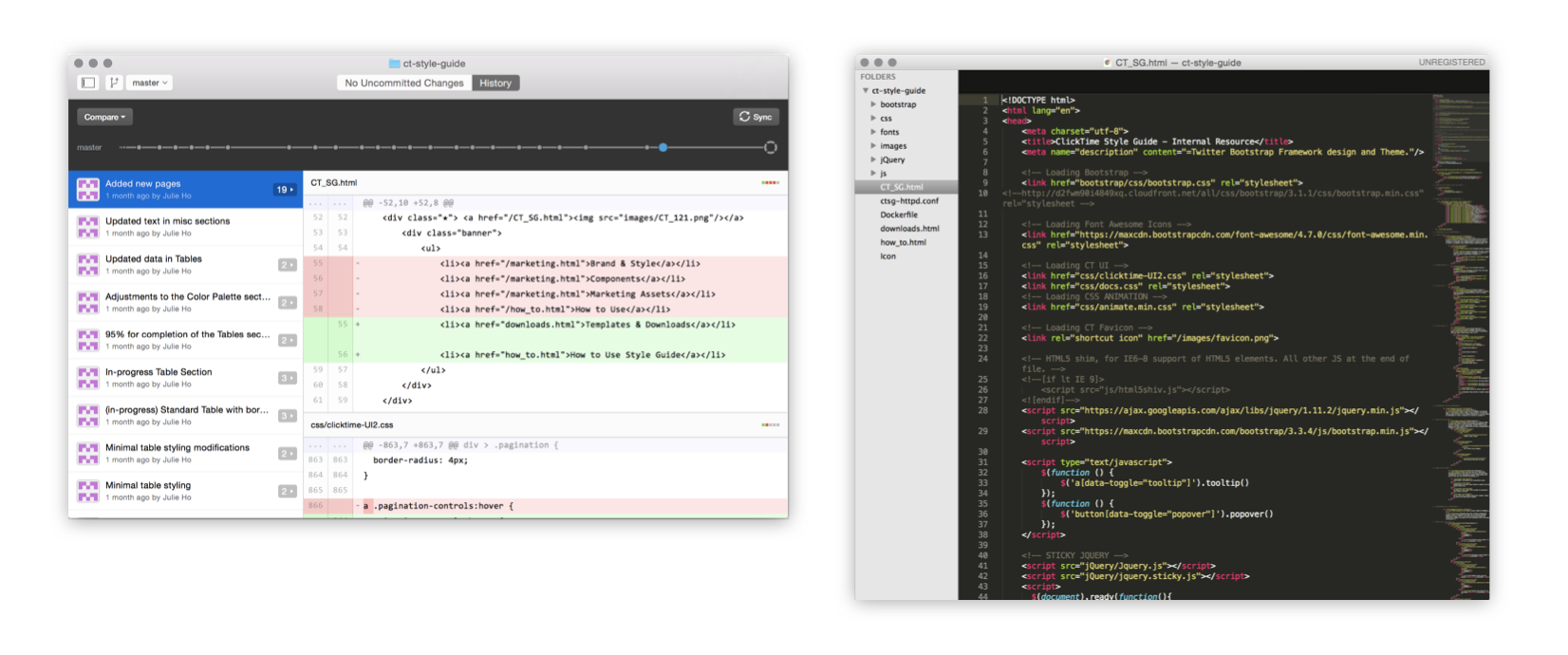
Development
Git and Sublime Text 2 were my tools to develop the style guide and maintain of each version update. I practiced regular maintenance of the components and constantly sought feedback from the developers, PM, and QA.
✨ ClickTime Style Guide ✨
Reflections
Challenges
The creation of the style guide and UI components library was initially started as a side project to help with my core UI/UX responsibilities. As it began gaining traction, it steadily became a core project and required juggling with my other projects. Addditionally, because many of the older pages in the app used legacy code, the changes required several approvals and effort from other departments. There were many layers for me to detangle in order to gain traction.
Looking forward
During the implementation of the style guide, I quickly ramped up my front-end development skills as I was the main contributor and also learned so much about coding.
At the point of my departure, the style guide was steadily decreasing design debt as it serves as a reference guide for the PMs, developers, and QA teams for new development and code refactoring. Though I am no longer at the company, I believe this guide will help the team's prospective designers acclimate to the software and also offer the space to improve its components.